Alternative to recall
Our Collaborations:
This is a student project at the Royal College of Art, Service Design Department. Our client Catch 22 is a non for profit social business with a mission to build resilience with a heart of a charity, and the mindset of a business. They deliver services across the UK in areas like education, training and justice. Our project was a part of the Catch 22 justice hub with partnership with HM Probation Services.
Our Brief:
Catch 22, is building a pilot for an alternative to the recall system that will be launched in January 2022 for those who are recalled and pose no threat to society or themselves. Through this project, we plan to look at the pilot from a design thinking perspective to deliver interventions to make the pilot run even more effectively.
Our Intervention:
QuickFacts is a collection of guides that compile information based on the most common needs and inquiries of the people on probation before, during, and after their journey. It aids in navigating the people on probation in order to comprehend their needs and the actions/steps they must take.
Challenge
Over the coming years, there have been nearly 6,000 people from the prisons in the UK and being recalled and this is due to a breach in their licence terms this costs the UK government on average 17.1 billion per year. So why is that an issue? The recall rate is mostly due to not understanding their terms NOT committing otherwise. And More data shows that 41% people on probation involved a charge of further offending, 72% people on probation involved non-compliance, 28% people on probation involved failure to keep in touch and 23% people on probation involved failure to.
The Journey
Our Client, Catch22 built a new release journey adding Navigator Mentor as a new actor, who navigates the person on probations through the initial stages of the release journey. The image below represents the journey;
Research Approach
Collaborative | Empathy | Safe Space
During all our research we kept our values reflected in our research approach, especially for people on probation. We made sure to focus on, Human Centered, give choice to the People on Probation, creating a Safe space and having a Participatory Approach. All these techniques is intended to give people on probation the choice for participatory discussions and also made sure they feel safe to share freely.
During this process we spoke to multiple people on probation as well as Probation Practitioners along with our clients Catch22, who were running the pilot programme.
Insights
A knowledge gap
Our initial insights were based on trust and communication between the person on probation and the probation system. We further researched deeper to understand the causes for the lack and trust and communication and what stood out was; Probation is a new journey for them and a lot of times they find it difficult to get the right information from the right source. Lack of personalised involvement with them and lack of trust both help in building the knowledge gap even bigger which results in the people on probation acting on inaccurate information that they have received.
Problem Definition
How might we provide PoPs with the information that they need at different stages of their journey so as to fill in the knowledge gap with the right and accurate source?
-

Affinity map of information people on probation need
-

Graph showing accuracy and accessibility of information
QuickFacts
Instant answers for the most common questions of people on probation
QuickFacts is a collection of guides that compile information based on the most common needs and inquiries of the people on probation before, during, and after their journey. It aids in navigating the people on probation in order to comprehend their needs and the actions/steps they must take.
It aim to solve the problem of information inaccuracy by making it easier for them to access this booklet from the probation service via the multiple easy-to-access touchpoints in the pilot program. The guides are updated in regular intervals with continuous consultation by the probation service. We understand that text-heavy guides are usually left unread by consumers and hence, quick facts are designed in a tabular and more visual format where information is easy to consume.
Overview of Quickfacts
What’s inside the guide?
How does it work?
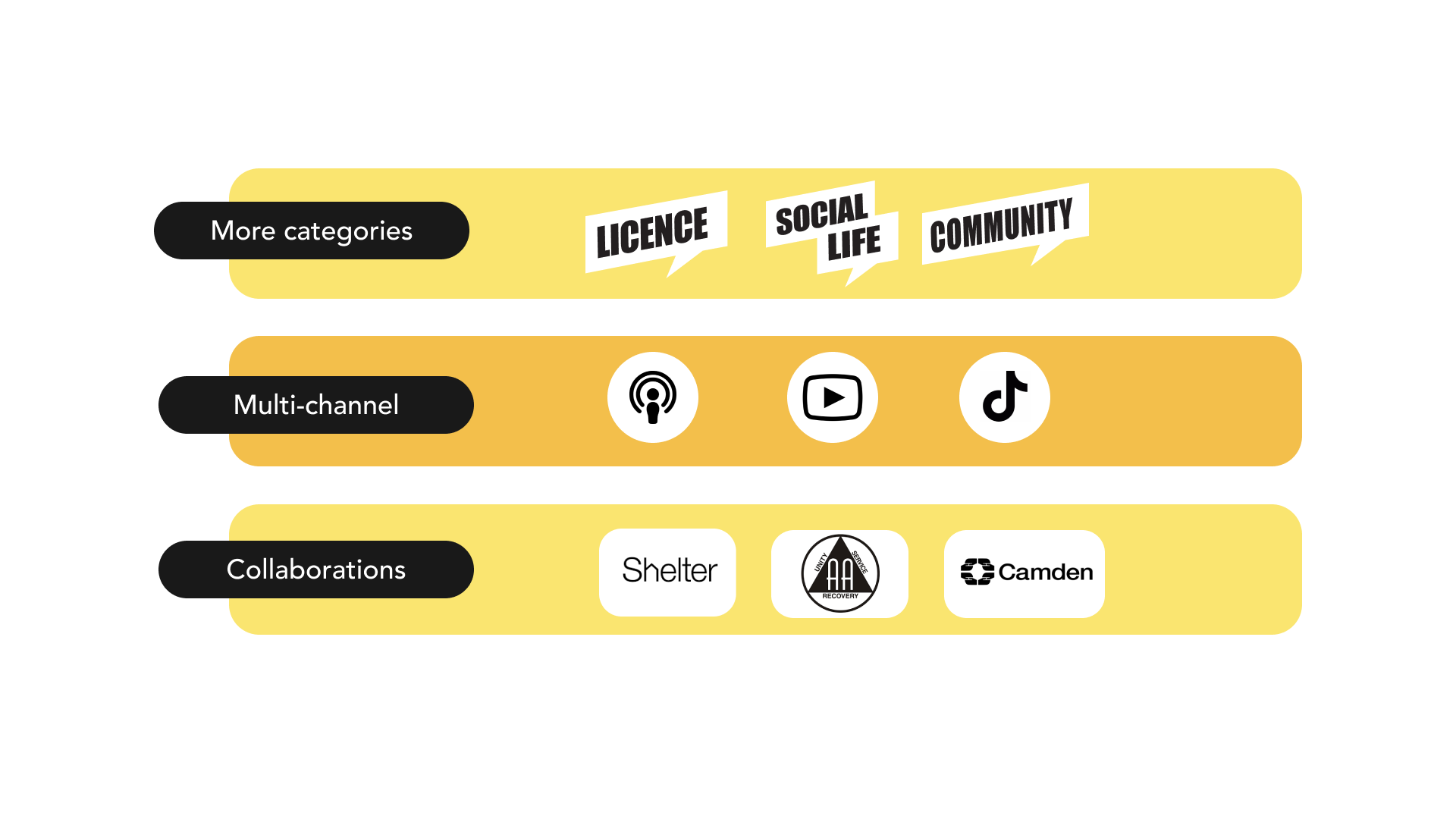
To introduce quickfacts, Probation Services will give the booklet to people on probation during onboarding, so people on probation could read it through and get prepared before they get released. Asides from the core need guides that cover an array of essential needs, there will be other themes to the guides, handed out at different stages of the Pilot. In future, these guides can be converted into various different audio/video mediums and can also be made in different languages for higher accessibility.
The design objective for the main content page was to keep it easy and more visual. Readers need to understand the information through easy steps. In our research, we found out that content-heavy pages are usually ignored by the readers and they skip reading the important bits of information. We have added a separate section for Tips where they can find information like the documents they need to keep handy to be able to do a particular task or add the various links for forms or web-based information.
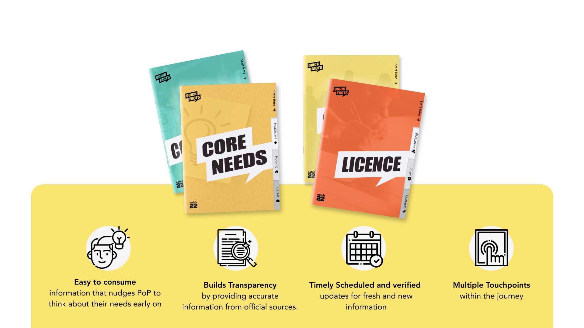
Value Proposition
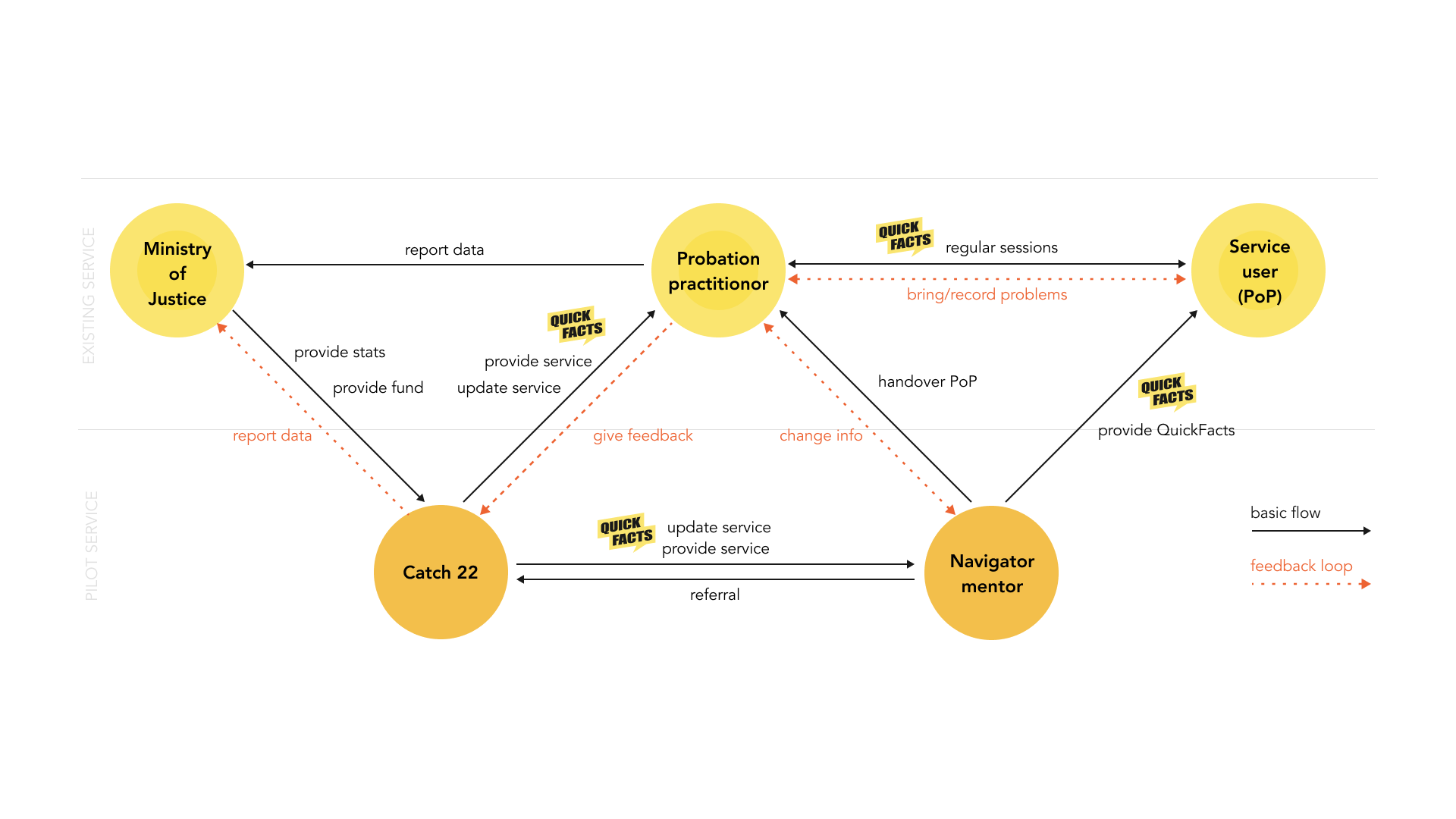
Systems Map
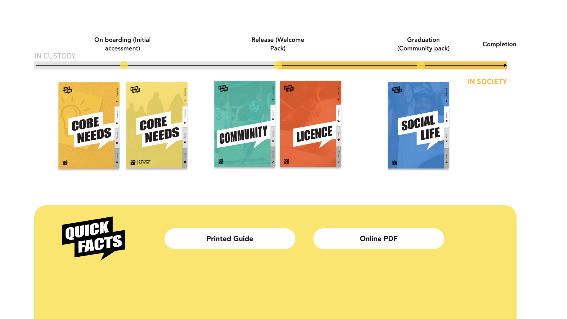
Timeline
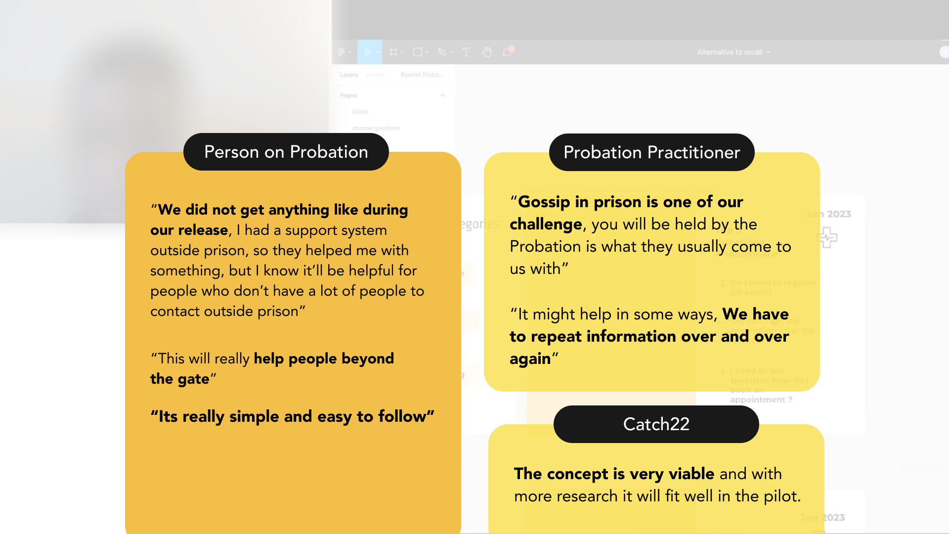
Validation
Future Opportunities
TEAM MEMBERS:
Nini Lin | Yuxin Wang | Cihong Song | Riddhima Ramnani | Priyanjali Rane


